

I saw a presentation recently that got me thinking once again of the ever-present clash of good vs. evil, light vs. dark, roadrunner vs. coyote , Coke vs. Pepsi, and the greatest of these: content vs. white space.
It is as an in-house designer that I have found this struggle to be at its peak incarnation. My work more often than not consists of finding the delicate balance between designing to the visual/white space aesthetics I know are essential to quality layouts, and the content that is critical to the client and end user.
So What Is White Space?
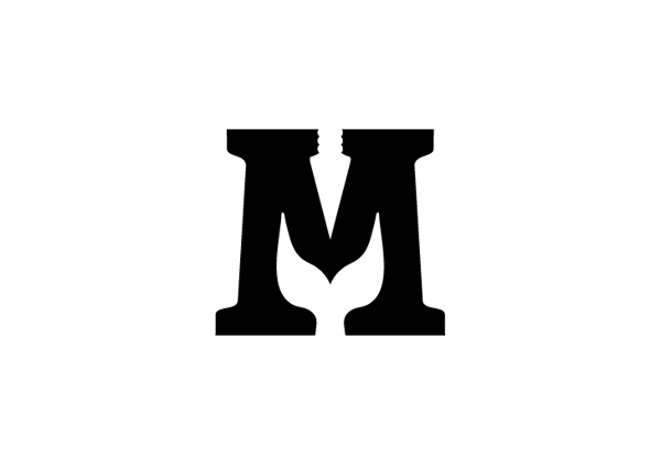
The simplest definition for white space is the “empty” area on a page not occupied by elements, be they text, images or graphics. This space can also be called negative space. The logo below for the book Moby Dick is a very clever and unexpected use of white/negative space.
Another good example of white space is shown in the gallery below. Only view it if you never want to see the FedEx logo in the same way. If you already know what I am talking about, then you are a visual superstar!
FedEx’s use of what designers call “trapped white space” to emphasize the efficiency and expediency of their delivery service in a subtle, subliminal way is a brilliant design solution.
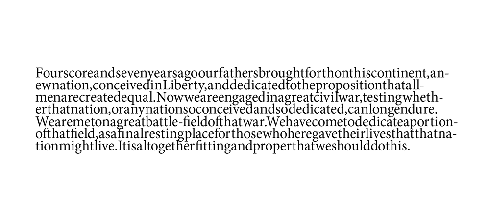
Whether you like it or not, you use white space every time you type out a sentence. Here is a famous speech without white space:
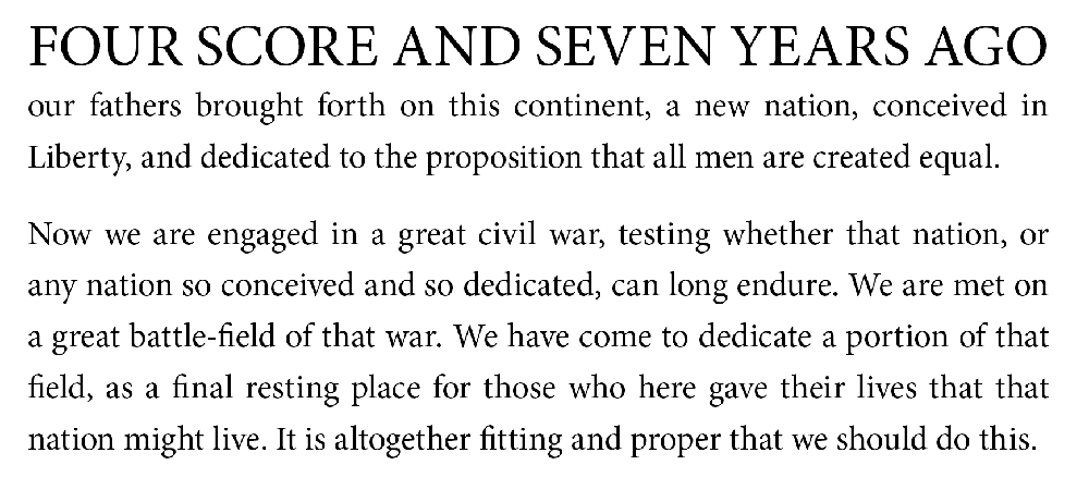
And here it is with white space or as it is commonly called: letter and word spacing and leading (sentence spacing) and a little design:
White space helps our brains make sense of what we are seeing. Without it, visual layouts become a jumbled mess like a sentence without any spacing. The viewer will struggle to understand what the client or designer wanted to convey, what message is most important, what key takeaway they should leave with. In the same way that artists such as Leonardo da Vinci used perspective techniques to lead the viewer to that which was most important, designers use white space, visual hierarchy, and graphic element layout to guide the viewer around the page and aid them in finding the information critical to them. White space also gives the viewer a nice quiet place where they can rest their eyes.
But What About All the Important Things I Need to Say?
You might be saying, “That’s all good, but I have a whole lot of information to get across to my end user.” To that I say yes, there are times when you want and need to get rid of white space and maximize every last empty space of your layout. A good example of maximizing space and deleting as much white space as possible is the classified ads page of a newspaper.
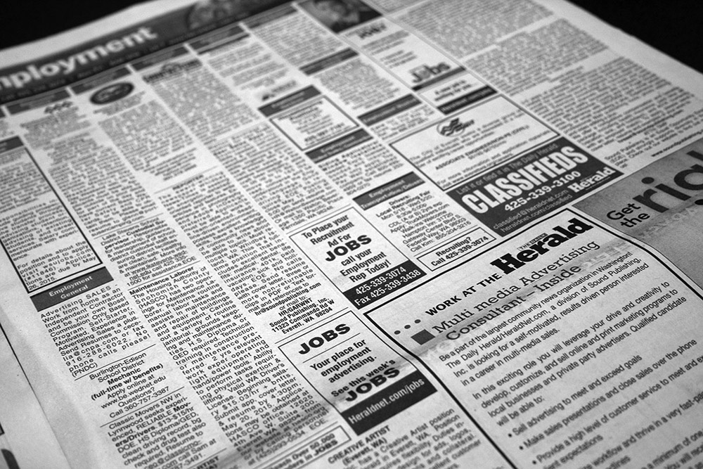
Here, the goal is to get as many ads in one spread as possible in order to monetize every inch of space.
Realistically though, designs, layouts, ads, or presentations do not call for this level of space densification. Usually, there are a minimal number of key points or goals that need to be conveyed visually. If you want your message to be received and acted upon, you have to first decide what goal you are trying to achieve with it, and then you can clarify, distill, and edit your message to its most concise form possible.
Suss it out people!
We should suss out the key idea we want to communicate and design around it, laying out the graphic elements in such a way that our key idea is obvious and able to stand on its own. In 1959, Volkswagen created a game changing ad campaign called Think Small.

Its use of white space was revolutionary for its time, and the ad is now considered one of the best ad campaigns of all time.
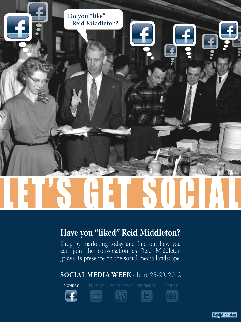
For our internal social media engagement campaign, I created posters using white space and visual hierarchy to make it easy to navigate and glean the information critical to our efforts.
You might think you need lots of content and lots of space to say what you want or need to say, but just like it is said that a picture is worth a thousand words, I say that any graphic element, be it text, image or graphic, is worth a thousand words. Take the word love. It does not mean just one thing but a world of possibilities. Even standing on its own in a sea of white, it can convey many things.
Final Thoughts on White Space
While there is technically and scientifically nothing in the white space, used wisely, it can convey more than what is actually there. A Chinese poet philosopher once said:
Thirty spokes share the wheel’s hub;
It is the center hole that makes it useful.
Shape clay into a vessel;
It is the space within that makes it useful.
Cut doors and windows for a room;
It is the holes which make it useful.
Therefore profit comes from what is there;
Usefulness from what is not there.
Laozi, Tao Te Ching – chapter 11
So here are three key things to remember about white space:
- It is important
- It is useful
- It is necessary
Use white space and use it wisely!
Wanna see some more white space? Here’s a link to a peer’s Instagram feed that contains a lot of minimalist, white space design. Reid Middleton is not responsible for the content of external links

Interesting!
This is a good article
A great read! Well put. Thanks.
White space is so much more important than people realize. Its one of the important reasons that two articles on a similar topic written by authors of similar popularity can have vastly different views.
Articles where all the information is blocked together in huge paragraphs with tight fonts will get less attention because the first impression will turn off a large number of readers.
Love the article. Thanks for posting.
Reblogged this on Mind of a Future Femgineer and commented:
This article highlights some of the importance of white space (negative space). Many of us don’t give it much thought, but its vital to marketing as well as design. As an added, there’s an interesting design in the FedEx logo I never noticed until now, and I will never unsee!
Whether you’re trying to entice readers, sell a product, increase recruitment, or create a eye catching design-its good to be familiar with white space.
wow i had no idea white space played such a critical part in what you do understand and what you don’t even bother with.